_FINAL

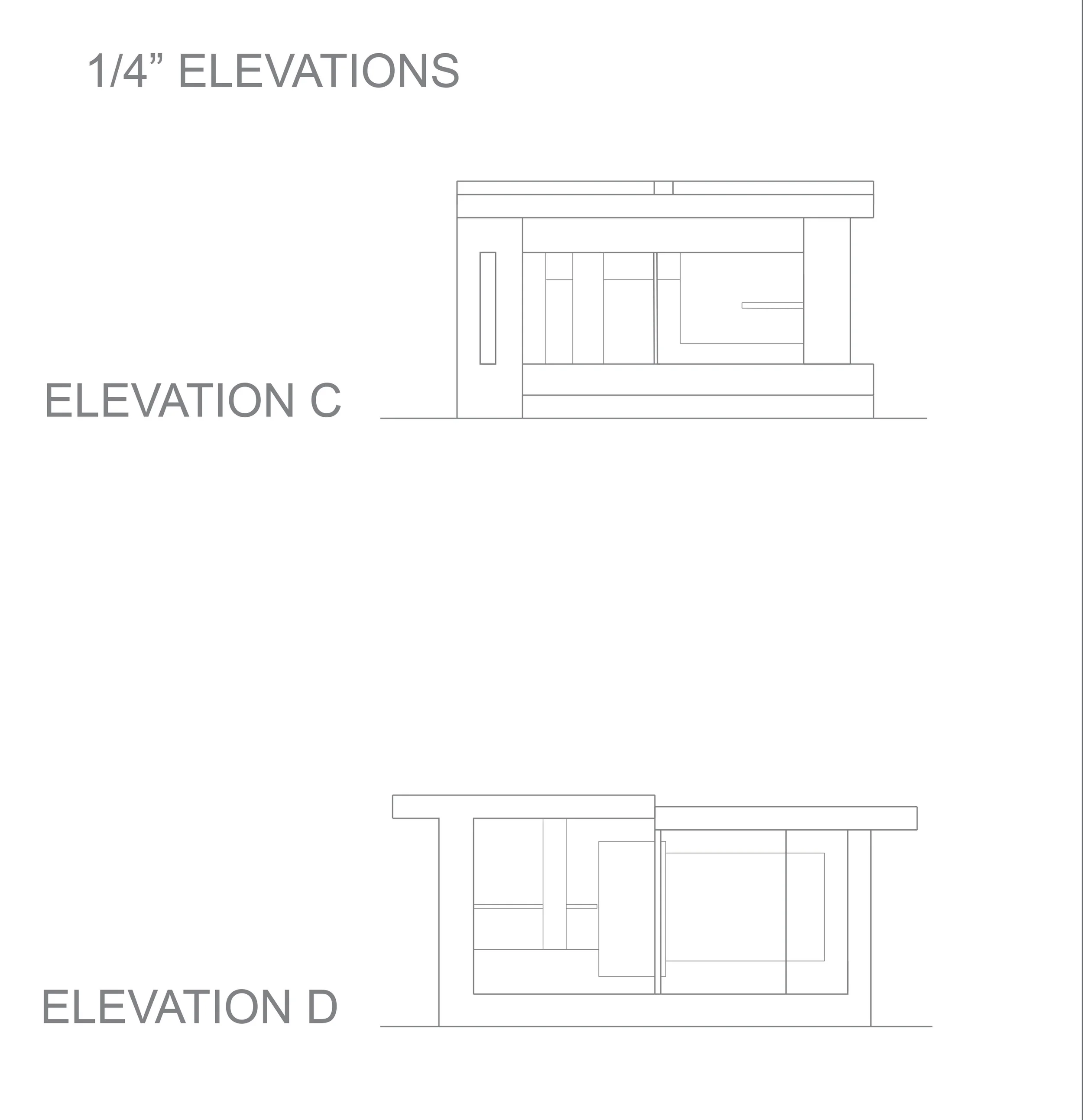
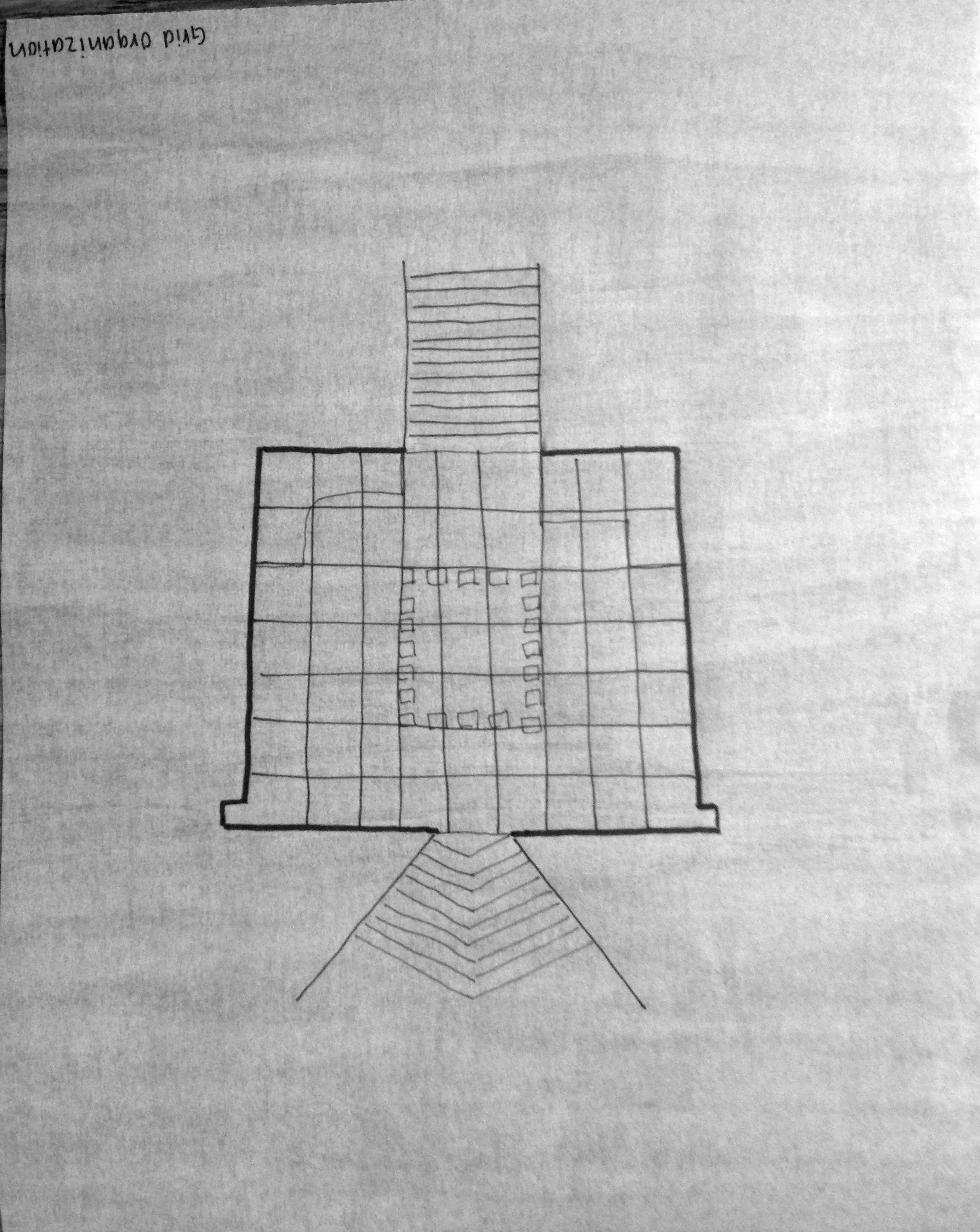
For this assignment, we will be going off of our original garden of shadows. Our goal is to make a better model of both the pavilion and garden, and also incorporate the use of light and color within our pavilion. 


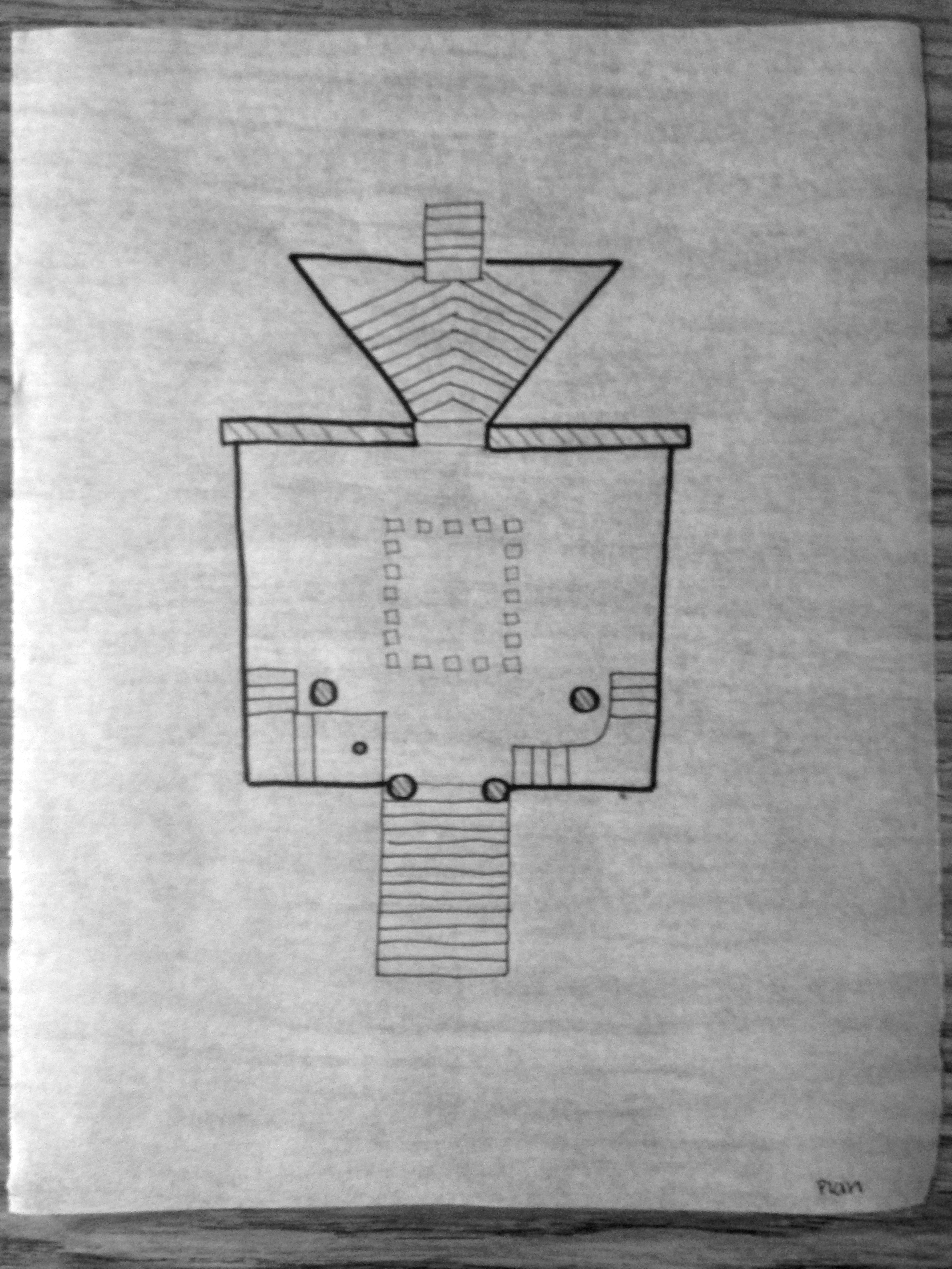
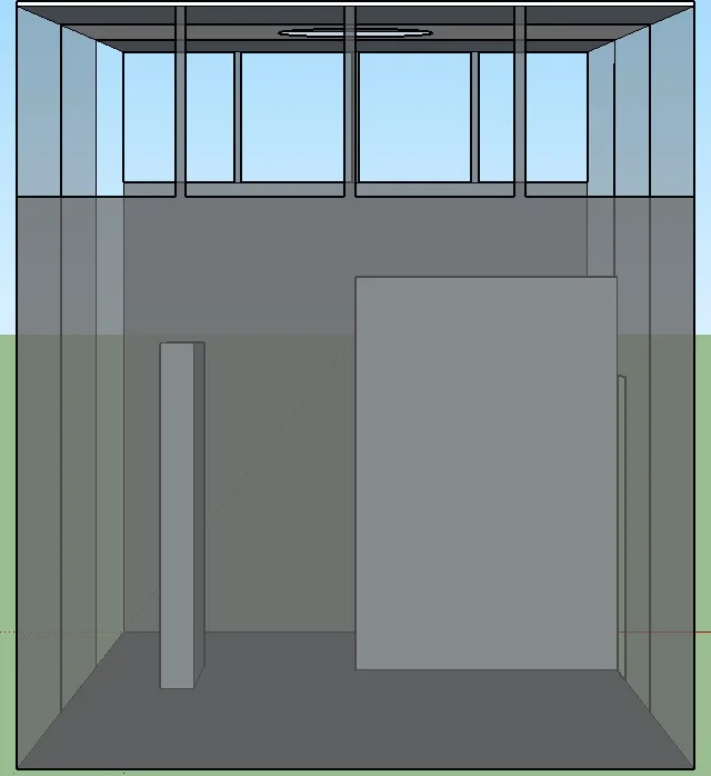
For our first iteration of this assignment, we had to listen to various composers and be inspired by their music. Out of all the composers, I choose John Luther Adams, because I liked the way he constructed his music using various tones from nature. Also the tone of the music was very dark and mysterious. From those conclusions, I tired to implement them into my design by adding a lot of areas where light, air, and sounds can travel through. I also placed dark slabs in two different areas in order to create circulation, and almost a mystery within the building. The only limitations that were given to us is that their has to be a major and minor space, and one of the spaces should fit 4-6 people comfortably. 

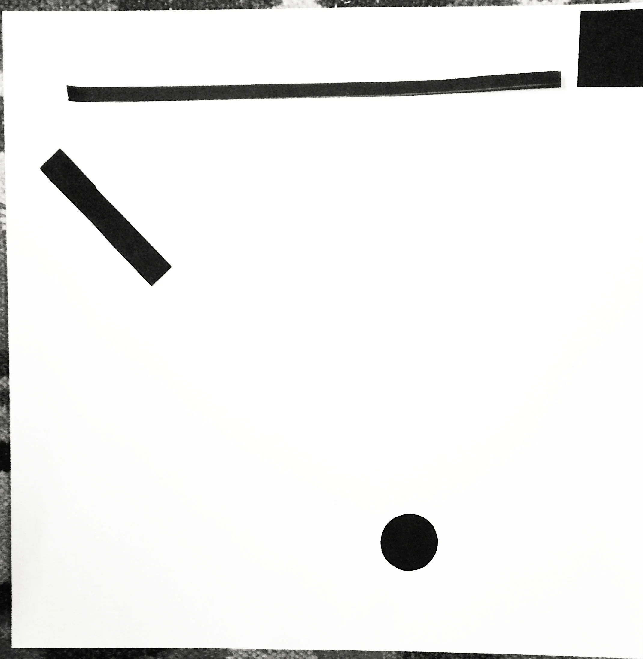
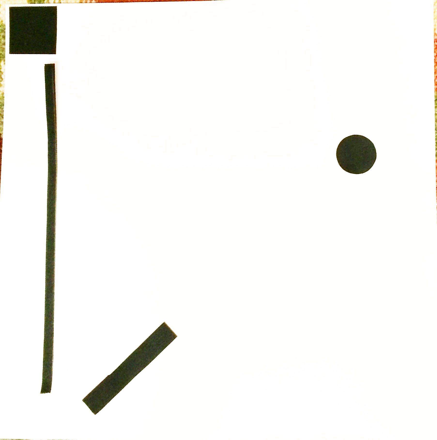
The next part was to match the music of our composer and create a tile pattern. 

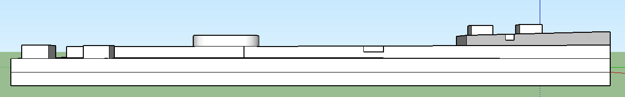
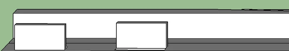
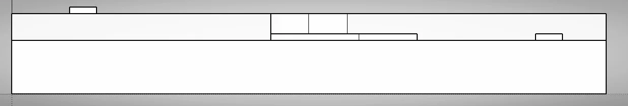
After many critiques and long hours we finally ended up with a pavilion, site model, photographs, and plans of our design. My pavilion changed completely from being a glass house, to a more supportive open air structure for my musician to work and host parties at. Lighting and circulation became a huge part of the design. My musician need the ability to see and experience nature, since that is a huge part of his music. So I made nature be easily accessible with openings everywhere so nature can be seen and heard. 

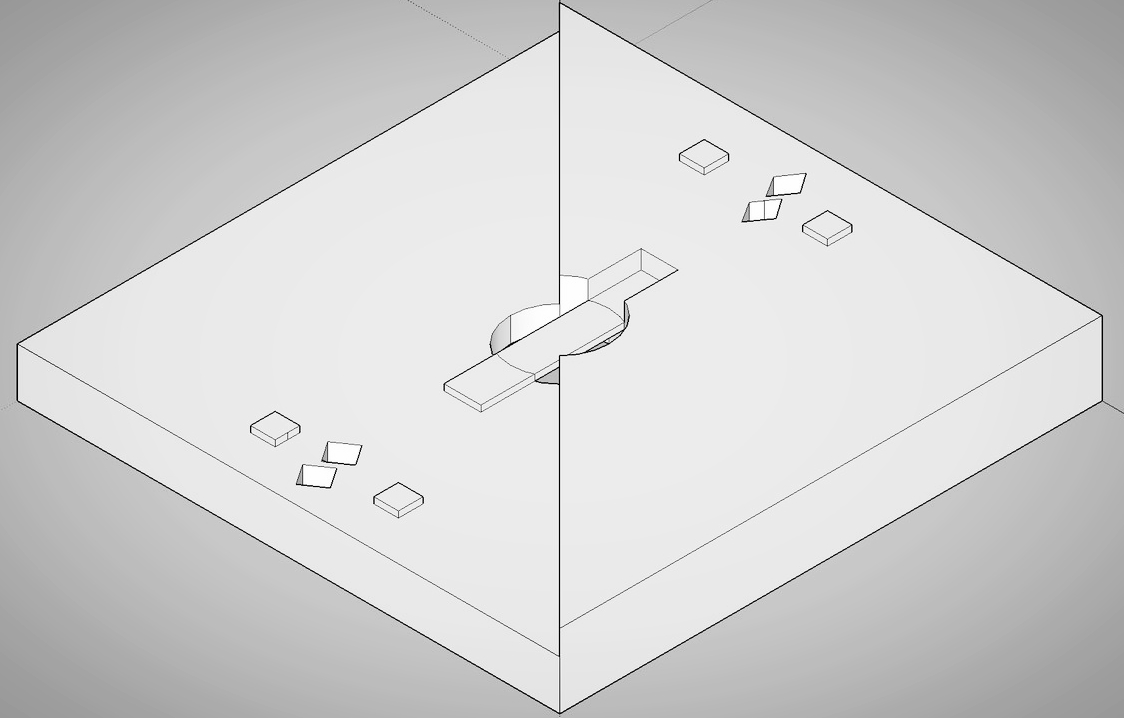
My site plan changed from my midterm to my final. I simplified it completely because I wanted to make my pavilion a major destination point. Coming from our final reviews I realized I should have used my landscape and my pavilion to be more intertwined because my pavilion could be on any site plan and work. 

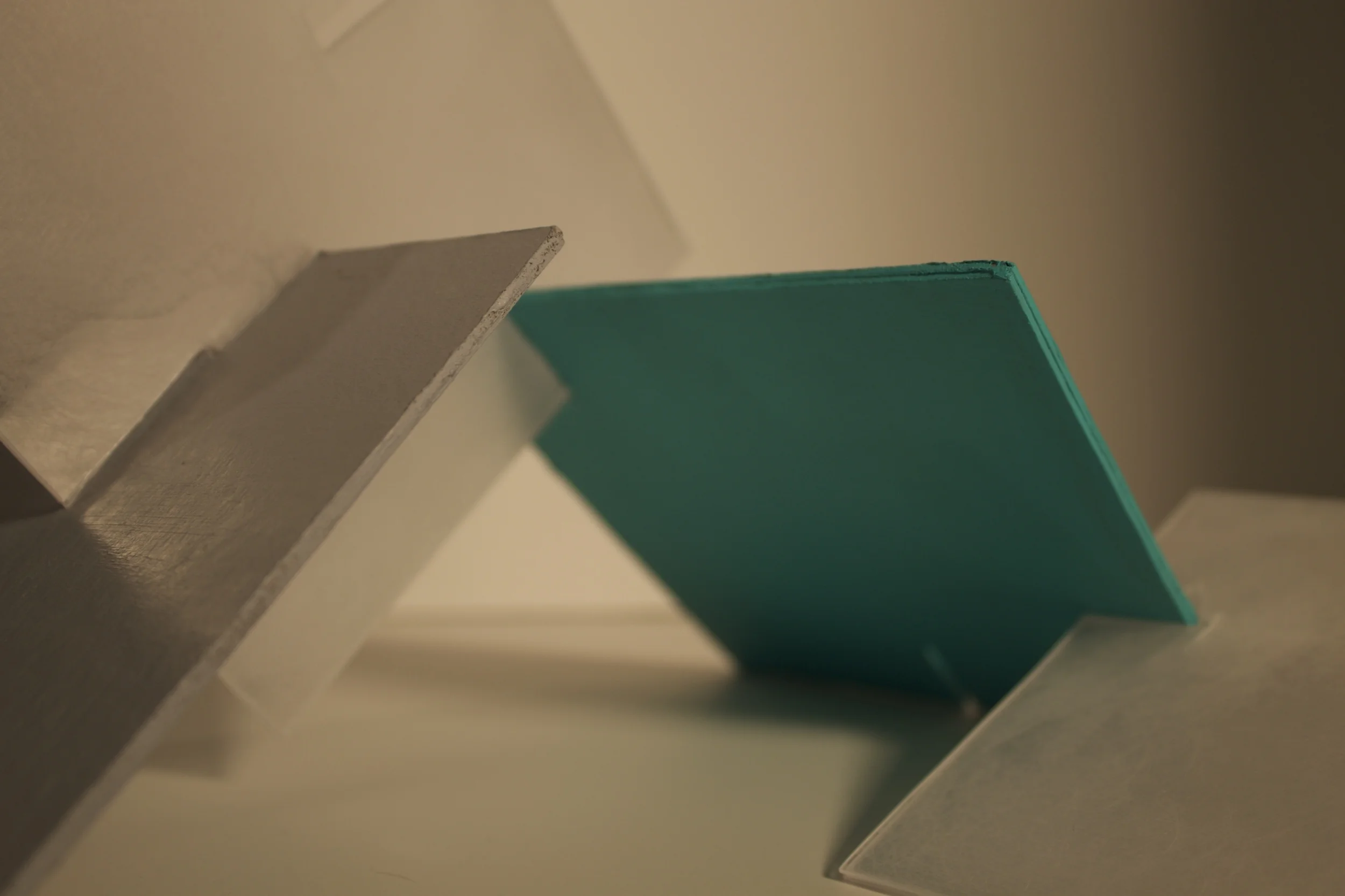
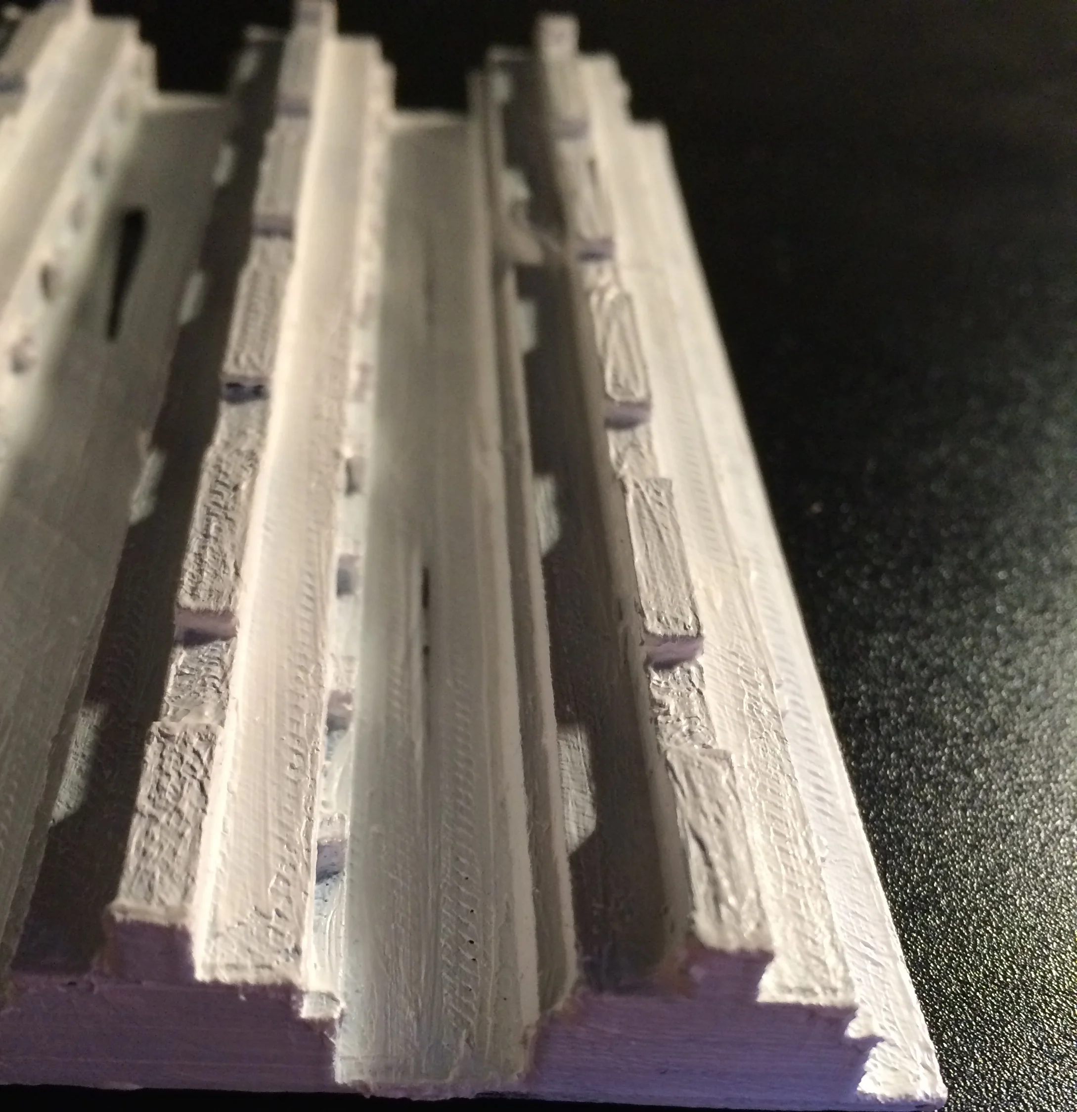
The use of light and color was a huge part of this project. I made lattice out of plexiglass and frosted it combining my desk that was colored blue. I took this idea from our color theory project, because the frosted glass made the color look more infinite. 

_08

In this assignment, we are taking at minimum three objects from our previous design (assignment 7) and creating a tile. First we had to make quick sketches that transformed into 5" by 5" squares. We choose our two favorite squares and made them into 10" by 10" squares done on illustrator. In this part we did value studies using 20-80% grey tones. The grey color is supposed to represent where out tile either went up or down. We then transferred our design into Sketchup showing the various heights, and we also made it 10" by 10" by 10" to show how the pattern would carry into other squares. All in all, I like the simplicity nature of my design, not to busy, but just interesting enough in order to keep your interest. 

The next part of this project was for us to create a 5 by 5 tiles on a 5' by 5' tile that is 6" thick. 

The next part of this project was to create a 5" by 5" by 1/2" tile. We will then use these and create a 3D model.

Our next step in this assignment was to work with cardboard and plexi-glass to create shadows using a light source. We got to choose one color and it had to be extremely saturated, and we also were instructed to use a 20% grey. This assignment was really interesting, because we only had one day to complete it and my group and I became very creative in both the craft and the photography. 

The next step from the project above was to go back and take more pictures using a camera in RAW, and using Light Room for editing. All in all, the pictures turned out cleaner and shows the light and shadows well.

For the final part of this assignment, we had to take one of our final tiles and 3D print. Overall the experience was really interesting, and I had a couple of problems with holes in my print. We then painted the model white, in order show light and shadows better.

_07

The goal for this assignment is to use our previous composition and revise the design to look like a garden.

The entrance is clearly marked by two squares that stick out of the lowest side of the garden. You walk in looking left seeing an element sticking out of the earth, and on the opposite side you see an element sinking down into the earth. Due to the Ying and Yang pattern of the four elements, one feels harmony and a relationship between these elements. The four elements are perfectly spaced to provide a clear path to travel on.

When the path opens up you look directly ahead your eye sees a dip and a sudden rise that leads you to a small object on top of a hill. The object is perfectly positioned to being half on the hill, and half hanging off. Your eye slowly drops down to a small dip bellow the circle a parallel line that travels limitless to the right. The small dip’s width isn’t that large, making it look like a small crack in an imaginary road that you have created. You follow that path and realize that it leads to a landing that can reach the small circle.

When reaching the top of the circle, you look down on an open plain that contains the entrance that you once walked into. The circulation of this road has now become less linear and you realize that you can climb back down to where you originally started, or start a new journey up to the highest point of the garden.

Walking up with the same gradual incline as you encountered before, you find yourself staring at four squares that are similar to the ones at the entrance. Yet, you notice that the pushing and pulling of the elements are in the opposite order as the ones at the entrance. You feel the gardens design come into a full circle. While standing on the tallest layer of this garden, one feels a sort of accomplishment from finishing that journey. You realize the feeling of overwhelming calmness and simplicity while gazing around the blank planes. Then, all at once, a small sense of wonder overwhelms you due to all the room left for you to embark on. 

The next images shown below, where down to revamp the design and create more divergent thinking. Therefore, the craft isn't as well done. Yet, this made me rethink my assignment, and I began to add and remove new elements and lines in order to add more of a journey to the design. The diagrams are supposed to show ideas, so it is not to scale nor done with a ruler.

This is the Final for Assignment 7. The Garden of Shadows took a lot of time, but I really liked the unity of the design, and the emotions evoked while looking at the design. The following images are a MDF model, a pavilion, axon, plan, and diagrams.

_06

For this assignment, we were teamed up in a pair of two and were given a well known house to study and present on. My team got La Casa del Ojo de Agua created by Ana Dewes and Sergio Puente. This house was created in Tepotzlan, Mexico in the 1990s. What is interesting about the house is that it is built into a mountain and only has one structured wall made out of mud and pebbles. The other walls are made of mosquito nets, and the building is two stories with a very open floor plan. Usually the ground level can be used to sleep, and the top level is for dinning. I think one of the coolest things about this house is that the roof was actually a mango tree incorporated into the structure. I think the main reason why this house is so amazing is that the building is so simple but yet so much is achieved. In these sets of drawings there is a floor plan, section, elevation, axon, and diagrams that include: adjacent spaces, linear path configuration, grid organization, and vertical movement. 

_05

With this following project, we could use elements like squares, two kinds of rectangles, and a circle. I took it upon myself to use a shade of gray as the color, and to use different angles both non-orthogonal and orthogonal. Throughout this project I focused on things like symmetry, creating a datum, and hierarchy. I believe my strongest composition out of the three is the one using symmetry and balance. I think it was an interesting piece because of the different spaces between all the objects, and the overlapping of the circle and rectangle. Even though there were different spaces I thought there was a really nice balance created. 

The next step in this process was to choose the best composition, out of the three shown above, and draft it on white bristle board. The most difficult thing for me was to make all the construction lines light and even, and the shapes dark and prominent. Line weight was also another obstacle to overcome. 

Draft of Final Composition

The third step in this process was to then take the composition and make a 3D model out of cardboard. I really liked working with the material, and I thought it turned out really well in the end. 

In the last portion of our assignment, we had to complete a plan, three sections, three diagrams, and an axon of our composition. For my diagrams I included major/minor space, small multiples, and symmetry. It was a time consuming task, even done on illustrator, but in the end it turned out really beautiful and showed the composition in a different light. We also had to do a 3D diagram in SketchUp. It was a really interesting thing to learn, because it added more   clarity to the composition. 

_03

In this assignment, we got into groups and created our own limits and expectations to creating an abstract picture similar to assignment one and two. We could only use shapes that included circle, square, and triangle. Yet, in each picture we were only aloud to use two out of the three shapes. On each page we were limited to only having three shapes on the page, and two of the three shapes had to be proportional to each other. All had to be filled with a shade of blue, and no stroke was allowed. Again in this project we used techniques like sketching and using Illustrator. We each had to have three variations of this project and we must show our sketch, construction lines, and final product. The objective of this project was to use major and minor space. 

_02

In this assignment we took the first days limits by only using line, square, rectangle, curve, and circle, but instead of cutting them out of black paper we used this program called Illustrator. The variations were the same as last time, meaning we had to use certain shapes for the first, second, and third variations. We had to include in those variations a sketch, one with construction lines, and the final. Using the computer was really useful because I didn't have to focus so much on making the shape look perfect, and I could really pin point which relationships worked, and which didn't. Copy, paste, and undo are great tools to help make design easier. 

_01

To kick off my freshman year as being a design student, we immediately began by learning how to use major and minor spaces. The task was to use a line, square, rectangle, curve, and a circle. There were three variations one just used the line, square, and rectangle; the second used the line, square, rectangle, and circle; and finally the third included the line, square, rectangle, circle, and curve.