For this project, we had to build an office space for the newspaper called The Mercury. The Mercury is a local newspaper for Knoxville, TN, and the meanings behind the name can be interpreted as the God or as the actual substance. Our job was to deal with the site, the existing building, design a cafe, stage, and screen.
When we were told about this project my professor, Scott Wall, told a story about mercury, and his experience of breaking thermometers and seeing how the substance moved. Unfortunately, due to health scares, mercury is not used as much anymore so the younger generations do not have an understanding of playing with mercury. I wanted to relate the idea of the story behind mercury and make it more relatable to younger generations; so I choose water.
I wanted to play off water by building up my landscape to resemble the three states of water. The trees within the site are white pines, native to the area, used not only to block the sound of the interstate, but to also be experiential while waking through. I used the term Väyäla, which is Finnish for choose your own path. I wanted the public to get lost within the sound of the trees and the different paths they can take from either waking to the cafe or to the office building.
The next state that I worked with was water, that was simple considering rain is a natural thing. I decided to have the site slope towards the existing office structure, and to have a ditch besides the highway to collect the water coming form that hill. All directing this water to a reflecting pool in front of the office structure. My idea was to put algae within the reflecting pool to clean the water, to either use or to just look at.
he third and final state is solid water. I drew from the ideas of dry gardens in Japan and how they use rocks to represent water. The solidity of a rock in general makes one feel stable and strong, almost existing as structures themselves. I think the large boulders are easy to get within this area, and the large scale will be a nice characteristic for the site.
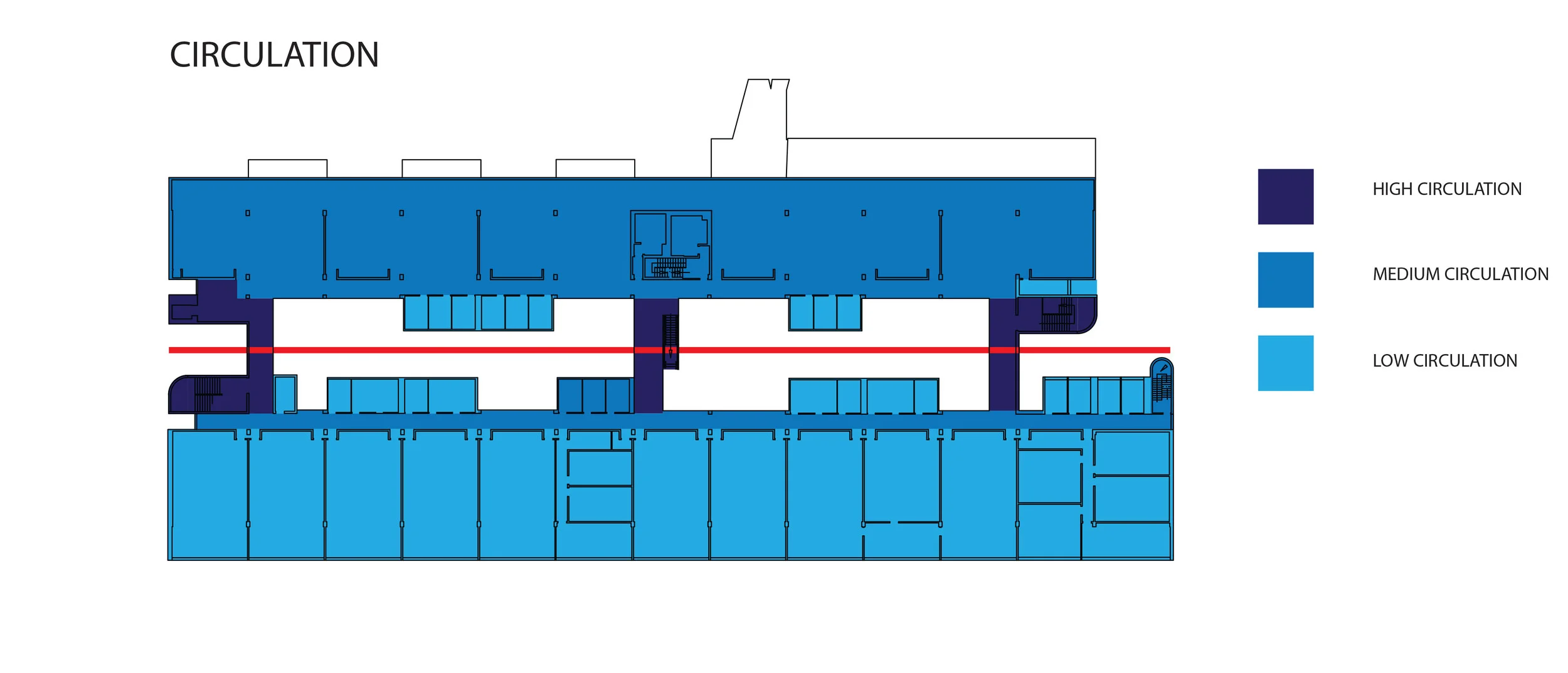
Moving on to the actual structures, the cafe and the office building where simple in geometric form, but they created a nice experience.
For the cafe, I wanted to embed the idea of water within the cafe, so I decided to attach it to the boulder in the back of the site. The wall facing the rock, is a plastic film that roles up in the summer so one can touch the rock, and rolled down in the winter so you can still experience it.
The office building was created to be both private and public space. In the back there is a archive and a gallery open split by a partition, used for the public. Then within the building their is a two-storie boulder, done to bring in the ideas of water but to also split private versus public spaces. When you walk past the rock you see a front desk to the left and to the right a conference room. The rock is not only used to split the spaces, but also to ascend to the second level by stairs. The second level holds 5 desks, a space for pin-ups and conversation, and bathrooms. The front side of the building is all glass, covered by a tin roof. This is done so when it is raining you can hear the sounds of the rain drops, and have it cascade down the front of the glass giving it a glossy effect.
All in all, I think I could work more on the buildings, so I can create beautiful spaces to match the site that I have designed.


Following this project, we had to make a final video to end our class. In essence, I wanted to capture the first year experience by having people tell me stories, while also showing peoples faces and hands while they are working. I did this because I think the main goal within design school is to shorten the span from what you think to how you can actually create it.